
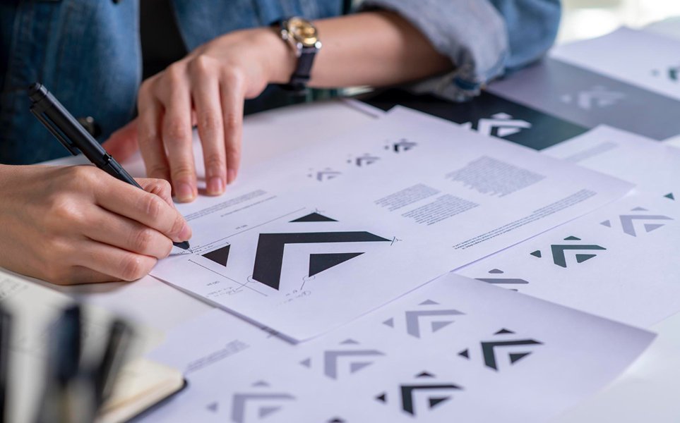
Perception is built from consistency, not spend
A brand doesn’t need a large budget to look considered. It needs consistency — the same color logic, the same type system, the same tone — applied without exception across every touchpoint.
Simplicity reads as confidence
Overdesigned identities often signal insecurity: more elements added to compensate for an unclear idea. A tightly restrained palette and a single strong typographic choice, used well, reads as more established than a cluttered one.
Where to actually spend
When budget is limited, spend it on the pieces with the most visible surface area — the logo mark, the primary typeface, and the homepage — rather than spreading it thin across every possible asset.
Grow the system, don’t restart it
The brands that end up looking established over time are the ones that extended an early, disciplined system rather than replacing it every year.